
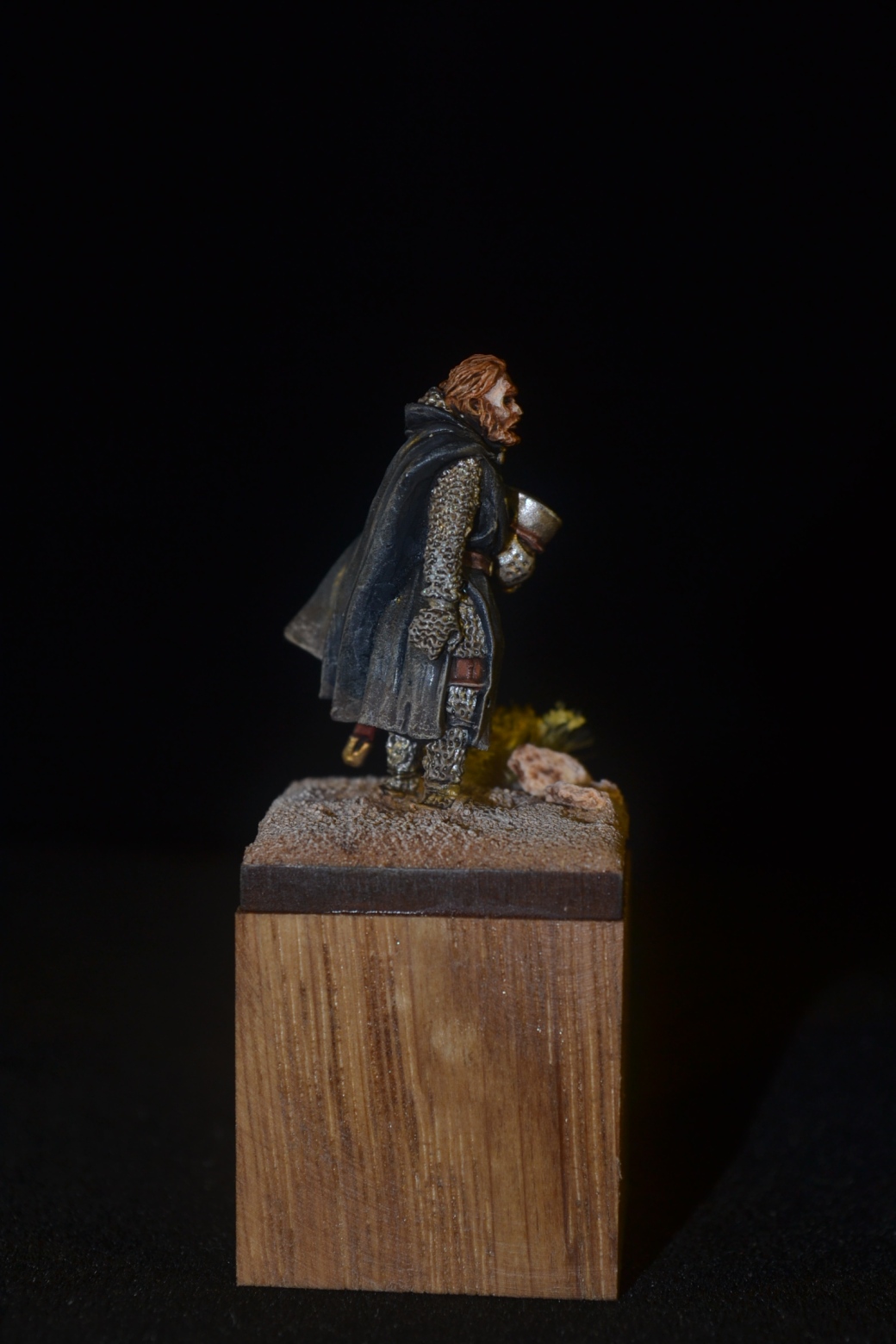
I have done this little chap a couple of times already, in both cases for little dioramas. The figure is from the Barons War range of Footsore Miniatures and is, in my opinion, a very nice sculpt, so much so that I felt he warranted a base of his own.
Not a great deal to say about the base or the painting on this one other than I elected to go for a Knight Hospitaller look and painted a freehand cross on his tabard.
TIM


Great model, I liked him in the diorama you did him in a bit back but he looks great just on his own. Well done on the black come out really well.
LikeLiked by 3 people
Thank you, appreciate the kind words.
LikeLiked by 1 person
Great work Tim, as a title for the piece could be “The end of the Crusade” as he looks weary from all the battles he’s been in
LikeLiked by 3 people
That’s a good shout Dave and a far better title than I came up with. 🙂
LikeLiked by 1 person
Very nice, Dave! 🙂 The cross and the hair add that nice bit of colour!
LikeLiked by 3 people
Thanks John. I can’t take credit for the uniform design but the cross breaks up the boredom of one colour that’s for sure. 🙂
LikeLiked by 1 person
He looks superb.
I really like the dirt and grime of the cloak.
LikeLiked by 3 people
Thanks Jenn. I like weathering at the best of times but it seemed essential with this figure. 🙂
LikeLiked by 2 people
He certainly suits the dirty look.
LikeLiked by 2 people
Brilliant piece mate – it’s a cracking mini & can read in different ways depending on how it’s painted . I love the tired war-weariness that you’ve captured here – lovely work.
LikeLiked by 4 people
Cheers Alex. My hat (if I wore one) goes off to the sculptor, it is a very expressive figure. Quite how they mange that I will never know.
LikeLiked by 3 people
Excellent work.
LikeLiked by 4 people
Thanks Steve.
LikeLiked by 1 person
As others have expressed you did bring out the exhaustion and pathos in his face. The grittiness is just right, and nice freehand. Plus thanks to this post I have now added tabard to my lexicon so that’s a plus!
Beautiful job on a weary Knight Hospitallee.
LikeLiked by 4 people
Hospitaller damn spellcheck 🤭
LikeLiked by 4 people
Glad you like the little chap Mark and before to long we’ll have you talking English English! 😉
LikeLiked by 3 people
He’s fantastic, a great miniature (with a really expressive face) and very well painted, even by your standards.
LikeLiked by 3 people
Thanks matey, he is a very nice figure to paint. He would work for an Orc crusader if you fancy a conversion! 😉
LikeLiked by 2 people
I LOVE him. Not the guy, this would be against his oath anyways, but how the mini has come out.
You can really feel the wind blowing his cape away, the composition looks that dynamic. Base is simply perfect. I can see why you love to paint this mini more often. Face looks really good.
I’m also oggling Footsore Miniatures, wanted to get myself a few knights, even though its not really my period, they look excellent.
LikeLiked by 3 people
It’s a great sculpt and a joy to paint, so expressive. Footsore do some great figures. Do check out their character figures. They are a little more expensive but well worth it and very detailed. If you do take the plunge I’m sure you will not be disappointed. 🙂
LikeLiked by 2 people
I know they are a bit steep, that was, what prevented me from getting them as well, but I probably get myself some at some point – I even got myself some Antediluvian Knights and the Dürer-Galloglass – they are superb and I think the knights are also from War of the Bruce.
LikeLiked by 1 person
He came out looking good. The cape is particularly good and is one of those things, I think, that if you haven’t tried to paint one yourself one might miss the artistry that goes into a “simple” black cape. Very nice work on the Maltese cross too.
LikeLiked by 5 people
Thanks Ann. As you know trying to keep a single colour interesting, black or white especially, offers a challenge. Something to improve upon still but hopefully heading in the right direction. 🙂
LikeLiked by 4 people
Great work. Love the battered and weathered cloak..
Cheers,
Pete.
LikeLiked by 3 people
Thanks Pete and hope you are starting to feel better. 🙂
LikeLiked by 2 people
this is a great model indeed, and love the way you have treated him, he has the sort of ‘Thank F**k thats over’ style, wife said i should put some on blocks too, she likes them like that.
LikeLiked by 3 people
Thanks Steve. As I am not a gamer I do like the idea of presenting some of the figures on little plynths. These blocks are oak and were bought on Ebay for just a few quid. They are 25mm cubes and take a square MDF base of the same size perfectly. I do the figure on the MDF base first and if it turns out OK then I add the plynth. 🙂 They do larger sizes too and I use them as well.
LikeLiked by 3 people
Thats handy to know, i do have a bandsaw but not any oak… Yet..
LikeLiked by 3 people
Very nicely done Davey. Something I’ve noticed and maybe I’ve mentioned it before but a lot of the time the hair colour is of a ginger-ish look. Is this a direct reference to yourself or an indirect one do you think?
LikeLiked by 3 people
It is coincidental more than anything, although it is nice to see what I would look like as a knight! 😉. The base colour is Vallejo Game Color Red Leather which really works well when a wash has been applied for shadows and then the same color and the color made lighter for highlights has been applied after the wash has dried.
I also tend to use it more when the figure I have painted is generally dark in colour, as is the case here, for contrast. 🙂
LikeLiked by 3 people
This is a very nice sculpt and you painted it really well as always too! As others have said, I like the subtle and realistic weathering. This guy looks like he is wandering Outremer in the hopes of finding some water or perhaps some of the other knights he went into battle with 🙂
LikeLiked by 3 people
Thank you. He is a well sculpted figure for sure.
LikeLiked by 2 people
If Ive said it once I said a million time !! I cant believe you can put so much detail on a figure that’s only a tad bigger than the ones I do! When you said the plinths were only 25mm I had to call the wife in to make sure I was reading the metric ruler right, she was surprised as well !
As the mob have said he is a great figure, I’m sure you included him in your group one of the knights not long ago if my memory serves me right.
LikeLiked by 1 person
Never mind the painting Pat I can’t understand how someone can sculpt the the figures in the first place! Yes you are right, I did the figure for a little diorama too and I also did a mounted version of him as well.
LikeLiked by 1 person
Thanks for the kind words. I don’t know if Footsore have a US distributor but there figures are well worth a look. 😊
LikeLike
I thought so mate, and that is true about the sculptors, sometime we tend to forget them 🤔.
LikeLiked by 1 person
Some of them, all of them compared to me, are amazing.
LikeLiked by 1 person
The chain mail detail looks a little rough on the mini, but that’s a minor detail. Really great mini and I’d be pretty happy to add him to my collection. Just so happens that I’m looking at similar minis at the moment. Paint wise, what can I say…other than you knocked another one out of the park! Really nice looking and I especially like the beard and hair highlights!
LikeLiked by 1 person