
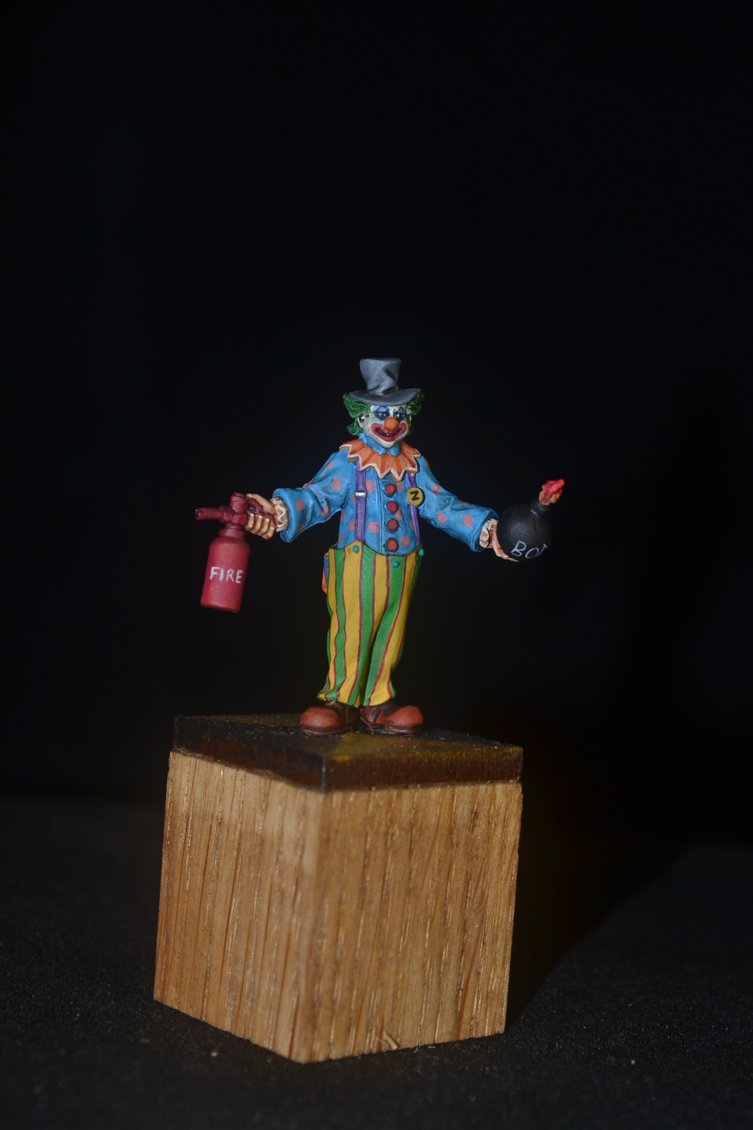
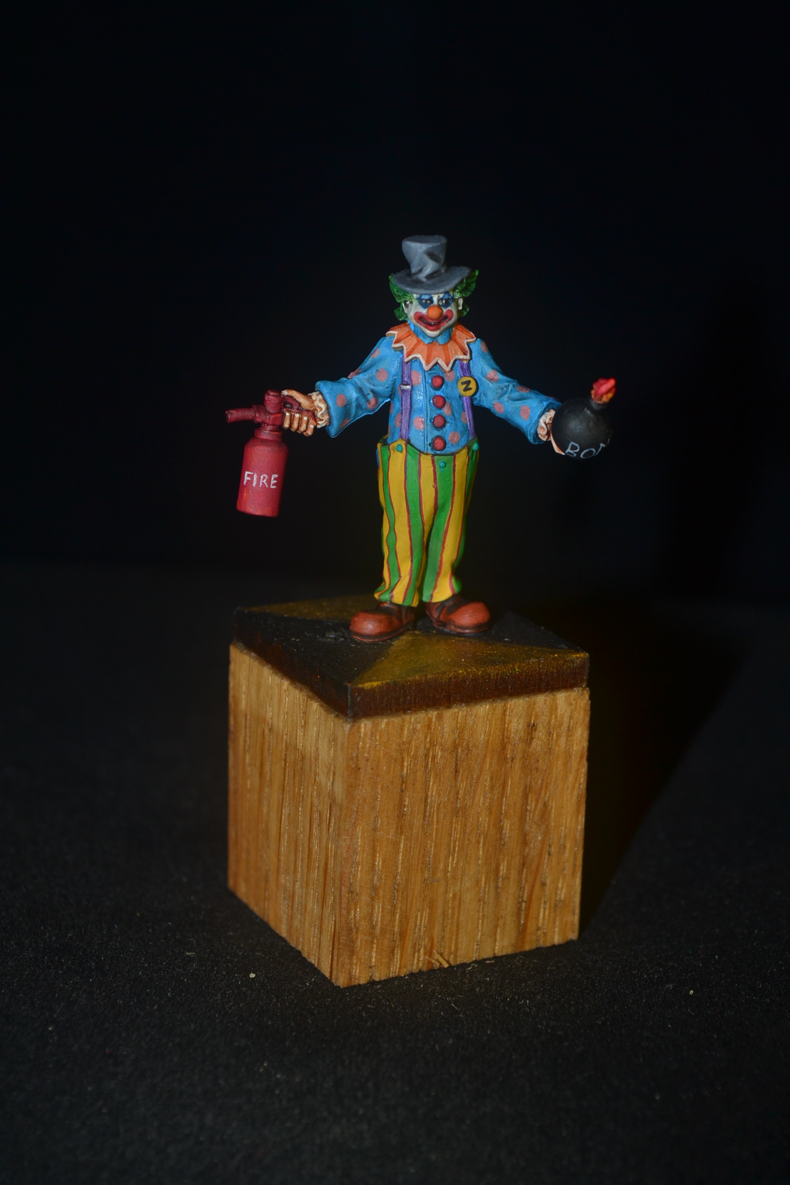
This week we have a 28mm Reaper figure from their Chronoscope range and before anyone points out the spelling mistake in the title the website has the figure down as Zonkers, Killer Klown with a ‘K’.
Not that long ago I painted another Reaper clown, Bonzo which I really enjoyed doing. As Reaper do two I more than fancied doing the other one.
Now as with most of us I suspect we are often our own worst critics. As a consequence I very rarely if ever express my delight at a figure I have done. That’s not to say I am not pleased in my own mind and I know when I have pushed my own boundaries. I say all that because today I am going to say that I am really quite chuffed with this little chap. Why? Well the simple answer is that this figure is without doubt the one I have done the most freehand painting on and all in all I think it turned out OK.
Firstly the shirt had freehand pink spots added to the blue base colour. To look at it’s no big deal but the effort of getting them roughly all the same size and reasonably positioned to look random took far more time than I anticipated. Not that time was a constraint, I just never envisaged it being the challenge it turned out to be.
Next up on the freehand was his trousers. I’ve done striped trousers before as in two alternative colours but this time I had a go at three stripes. The wider yellow and green but with a fine red stripe to separate the two main colours.
Lastly I elected to do some freehand lettering. A ‘Z’ for his Zonkers badge was stright forward enough but the word ‘FIRE’ and ‘BOMB’ were a lot more demanding.
The only other thing to mention is the figure comes with a choice of heads. The alternative option being essentially a head covered with a sack. Can’t say that did a great deal for me. I preferred being able to freehand some make up to his mouth and eyes.
Images below.
TIM


Kool! 🙂 You’ve done a kracking job there!
LikeLiked by 3 people
Thanks John.
LikeLiked by 2 people
Woah, that is superb mate – the stripes & spots are totally convincing, and even his wee pocket hanky got a bit of attention 😊
I’m most blown away by the makeup though… I’ve tried to paint a heavily made-up mini before & it was nowhere near this good – bravo maestro!
LikeLiked by 3 people
Thanks Alex. He was a little labour of love for sure but I loved being able to use so many different colours for a change. 🙂
LikeLiked by 3 people
Exceptional work TIM, the lines look perfect as do the dots, you have every right to feel proud of your achievement
LikeLiked by 4 people
Thanks Dave. This one was a joy to do but it took a long time!
LikeLiked by 3 people
Absolutely cracking work on the stripes mate, well really top work all round if I’m honest!
Cheers Roger, (I got here eventually 😀).
LikeLiked by 3 people
Thanks Roger, much appreciated. 🙂
LikeLiked by 1 person
Great work and as others have said great free hand on the clothes. I think the free hand writing is amazing, the word fire could be a transfer it looks so neat! So well done sir.
LikeLiked by 4 people
Thank you. It helped that the lettere were mostly straight lines. 🙂
LikeLiked by 2 people
That is great. Love the stripes.
Everyone love a killer clown too.
Cheers,
Pete.
LikeLiked by 3 people
Thanks Pete, glad you like the little chap. 🙂
LikeLiked by 2 people
Mate – I can’t stop looking at those stripes on his trousers, really, really exceptional work. I know I say that a lot but you’ve outdone yourself here, there’s so many little details and each one has been pulled off with aplomb!
LikeLiked by 4 people
Cheers mate. The nice thing about painting a clown is you can’t over do it. The rule of less is more doesn’t really apply. 🙂
LikeLiked by 2 people
I think this is definitely one to be proud of too! The freehand looks great and for me the lettering is impressive as you didn’t have a ton of room to work with but the letters look really clean and readable just like you’d want them to be. Wudugast is right about the stripes on the trousers as well. Those could have been easy to mess up with the folds in the pants sculpted into the clown but it looks like you nailed it to me.
LikeLiked by 4 people
Thank you. It’s certainly one I’m pleased with myself.🙂
LikeLiked by 2 people
Very nice job, your patience paid off big time. I really like the face as well, he’s the archetypal creepy clown.
LikeLiked by 3 people
Thank you. Patience was the key but I wont deny there was some inappropriate language at times!
LikeLiked by 2 people
Wow. Clownworld is real *honk honk*
The cloth looks phenomenal! Shades, folds and the free hand is simply stunning! I really love him, even though I couldn’t care less about a clown mini. The little hankerchief in his trousers is another great gimmick. Really love what you did with him. Also great work on his make-up and the stripes. As a Landsknecht-Painter those stripes are always challenge. Those dots on the cloth look seemingly like they are actually part of his clothings, not just painted on. Great job TIM!
LikeLiked by 4 people
Thank you. I am no fan of clowns myself, to be honest I cannot stand them but when it comes to a painting challenge they provide so much opportunity for colour and freehand work.
LikeLiked by 2 people
I’m constantly impressed by the neatness of your brushwork but I think that this is clearest here. Those pinstripe lines on his trousers, and the evenness of the spots on his hanky are just amazing.
LikeLiked by 3 people
Thank you. It was a triumph of patience over swearing I can tell you!
LikeLike
Well mate I cant add anything to what the other lads have said except F……. Brilliant Freehand!!
LikeLiked by 3 people
Thanks Pat, it was a little labour of love I can tell you!
LikeLiked by 2 people
Stellar job TIM! Having just done some freehand (nowhere near to this extent!), I can imagine the swearing behind the scenes. The worst, at least for me, is circles, getting the brush and the material underneath to cooperate is a chore. Add my fingers to the mess, and ugh. Since I use acrylics, I try to keep a wet brush nearby and basically pray the paint doesn’t dry in the split second it takes me to reach for that wet brush. Depending on the paint, I can sometimes be lucky enough to wipe away the mistake. Otherwise I end up having to repaint that spot. However, I know that you use oils as well, so I’m curious how you go about fixing up your spot mistakes? Now, I’m off to ogle the freehand some more!
LikeLiked by 3 people
You aren’t wrong about the swearing! As for this one no oils used at all, it’s all acrylics. I do use a wet pallet but for freehand work I have started to use Liquitex Flow Aid. It doesn’t dilute the pigment but it does keep,the paint wet for longer and does what it says, improves the flow. Good for blending too.
LikeLiked by 2 people
Ah, I didn’t realize you were using all Acrylics on some of your minis. I use a wet palette and Flow Aid as well. Though I still find some paints just like to dry on the spot. Maybe I should try dabbing the brush in Flow Aid and then try wiping away the mistake? Guess it wouldn’t hurt to try.
LikeLiked by 2 people
I see no reason why that would not work, worth a try.
LikeLiked by 2 people
You are so right to be proud of the work here. Truly flawless. It’s DA BOMB and you’re ON FIRE! Excellent color choices and brilliant brushwork. But what stands out to me are the subtle variations in the white face paint. SO good (I’m probably more attuned to that having done so much war paint lately!). Oh yeah, very Kreepy too.
LikeLiked by 2 people
Thanks Mark. As I have replied to others he was very much a little labour of love but did wonders for my freehand. 🙂
LikeLiked by 1 person
Wow! Yep you have not disappointed on this one. Very bloody cool man and definitely one of your best. The line work is nice and crisp and the colour choices are great. His face is sinister and the freehand writing is so clean it looks printed. Well done mate. I love it!!
LikeLiked by 1 person
Cheers IRO, the little fella took an age but it was worth it and he is very much a favourite of mine now.
LikeLike