

What we have this week is an experiment. Being honest it didn’t work out as I had anticipated. There is I think a simple reason for this. It was a tougher assignment than I thought.
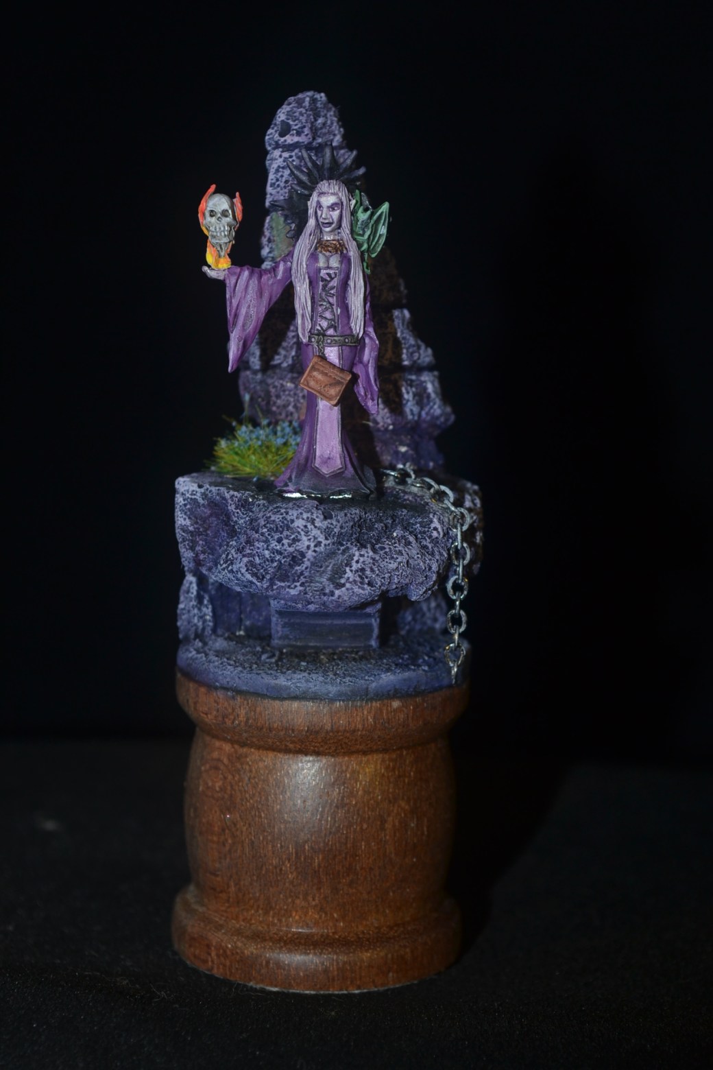
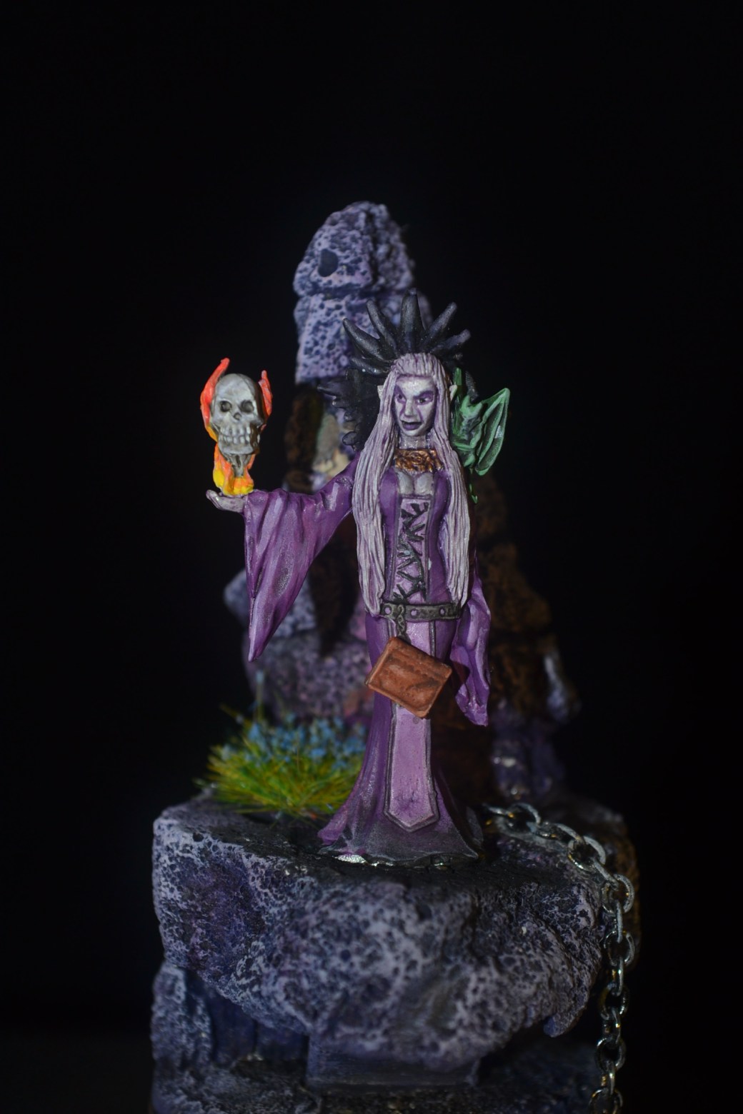
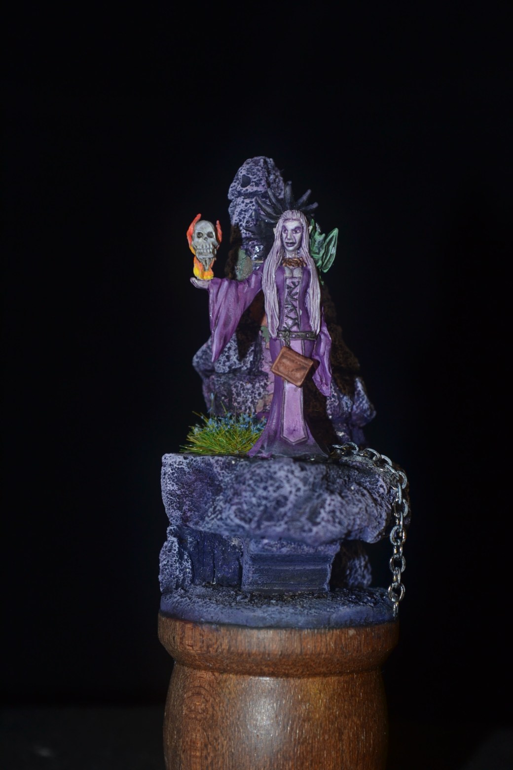
The figure is a “Diabolist”, a Reaper Pathfinder Miniature. The idea was to paint the figure and any base work using as much as possible a single colour and shades there of. I got the idea from a model I had seen during a google search. I thought it looked very cool and very different. Inspired I gave it a go. I can’t fault the quality of the figure, I rate Reaper as most of you know.
I decided on purple as the single dominant colour and I think that was my biggest mistake. I chose a colour I liked and that I felt provided a good gothic style mood but I struggled with subtle variation. I think this says more about me as an artist and my understanding of things like colour wheels than of the colour itself but on reflection I think purple feels like an advanced colour to work with. Had I chosen to go with green as the dominant colour I think I might have achieved a better contrast.
If I do another experiment along these lines (which I wont be any time soon) I will go with green. In the meanwhile I will leave you to make up your own minds and if you have any constructive criticism fire away as I’d be pleased to hear what you have to say.
TIM


Very nice! Looks fine to me Dave! 🙂 I’m assuming that you can see things to be unhappy about that I can’t see! Subtle variations in colour on “single” colour figures are going to be much more difficult to see than different colours would be anyway.
LikeLiked by 3 people
I think I had an image of what I wanted it to look like and the end result was simply way off the mark. In most of my models the end result difffers to some extent from what I envisaged (rarely does it come out better than I had hoped) but it has been a while since one has been so way out. I ought to have stopped and and taken stock really but then again, and not for the first time, I learnt a lot.
LikeLiked by 2 people
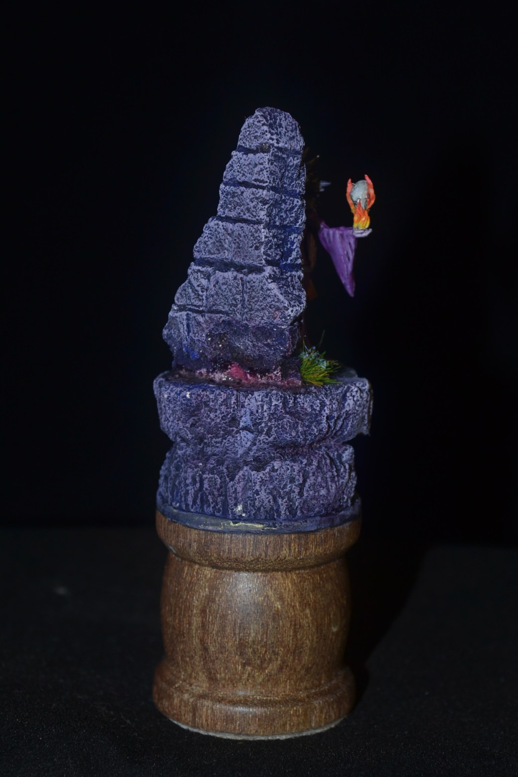
I think it works well but I found it interesting that my eye was drawn, straight away, to the flames more so than the miniature. I like the wall.
LikeLiked by 4 people
Interesting point about the flames. Just took another look and my eye is drawn in the same way. As for the wall I agree, it’s the best best in my opinon too. The figure overall is a fail but lessons learnt so in that sense worthwhile.
LikeLiked by 2 people
I wouldn’t say fail, not in the slightest, just not as visually stunning as your other works. I found the same when I took to painting miniatures in a black, white and grey theme/style. It was fun to try but a the result was a little bit lacking. I added splashes of blood which helped. Splashes of blood always helps haha.
LikeLiked by 3 people
We learn more by our mistakes so I am more than happy to put this one down to experience. That said it was nice to try sometning different. Some you win, some you lose.
LikeLiked by 2 people
I’ve certainly had plenty of losses in the hobby world haha.
LikeLiked by 3 people
I guess we all have, it’s how we improve.
LikeLiked by 2 people
Looks good to me- I find the green a bit jarring, possibly could have done with a bit of desaturating I think.
Cheers,
Pete.
LikeLiked by 3 people
i think if you wanted a model that looks purple, you acheived that, however if you want a model with more variation you need to add just an extra highlight. Get a torch and shine it where you want the light to come from, mix your purple with either a lighter purple or add small bits of white , thin it down to just a thickish wash and paint where the light hits, a little at a time, the extra brightness will lift it as its tonally similar at present..
Great model BTW..
LikeLiked by 4 people
Interesting Steve and food for thought. The idea of the torch is a good one and something I will have to take a look at. Cheers.
LikeLiked by 4 people
Looks good to me mate – maybe gets lost against the backdrop a bit, but still a cracking piece of work
LikeLiked by 3 people
Thanks Alex. It isn’t the worst thing I have ever done but the idea I had in my head never made it to the base and figure. All good experience though.
LikeLiked by 2 people
I find purple a hard colour and I only use it sparingly on a few of the fantasy figures ,but mate if you don’t experiment you’ll never know !
LikeLiked by 2 people
Wise words indeed Pat. 😊
LikeLiked by 2 people
To never experiment is to never improve. I do try new things all the time, some for better, some for worse. But all move me forward towards a higher level – and I am always inspired by your work. I have to say I do like the purple and grey – it’s effective on this figure. I might have gone with a less purplish and more distinctly grayish rock wall as a contrast to her overall color, but to me that’s small stuff. When I have used weird colors it’s always a crap shoot. With purple, I find it useful to use Army Painter shade and multi shades of different purples, but Dave, I couldn’t have done better so kudos.
LikeLiked by 1 person
You are right of course Mark. Never fear I shall continue to push my own boundaries. Somewhere along the line I need to study colour more. Either that or stick with box art or copying others!
LikeLiked by 1 person
I like it, it’s definitely challenging to work with such a limited pallet but for a first attempt it’s pretty good (remember that first attempts rarely go well – think of playing the guitar or having sex, and hopefully not of parachute jumping). My only change would have been to mute the flames down, or do them in a shade of ethereal purple as well – like IRO that’s where my eye was drawn immediately. Could be interesting to see a series of these, one for each of the primary and secondary colours. Not that I’m suggesting you tackle that if it’s not something that your heart is in, but like we were saying the other day about orcs and cowboys, taking on things outside our comfort zone is where we learn best.
LikeLiked by 1 person
As experiments go it wasn’t the worst attempt at something undertaken for the first time (as I have never jumped out of a plane or attempted the guitar I’ll have to go with sex until I can come up with a better option!) but neither was it the best. Some bits jumped out at me at the time and afterwards too and the feedback comments, including your own are all commendable and worthy of note. Not sure I will go with the dominant colour experiment again though. I like the concept but even if I had done it well I think I prefer to use a wider colour pallett. What it has taught me is I would like to better understand colour wheels and all they entail.
LikeLiked by 1 person