

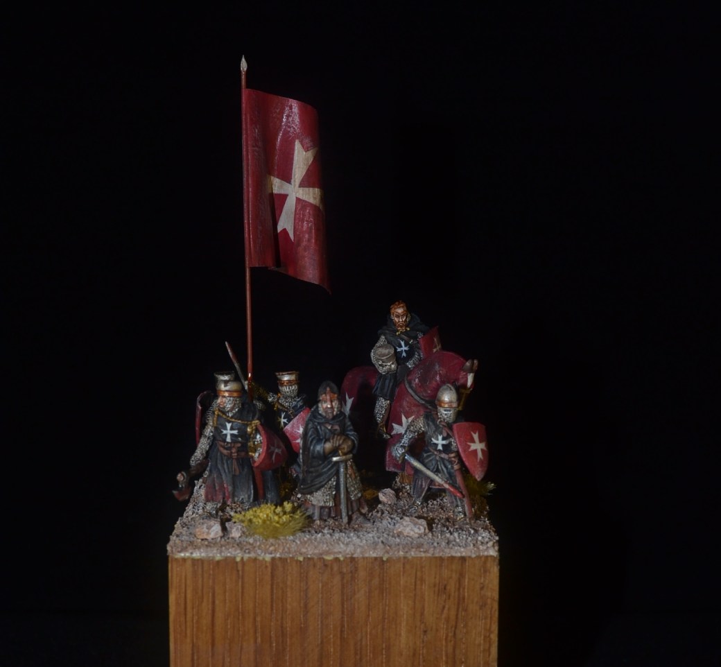
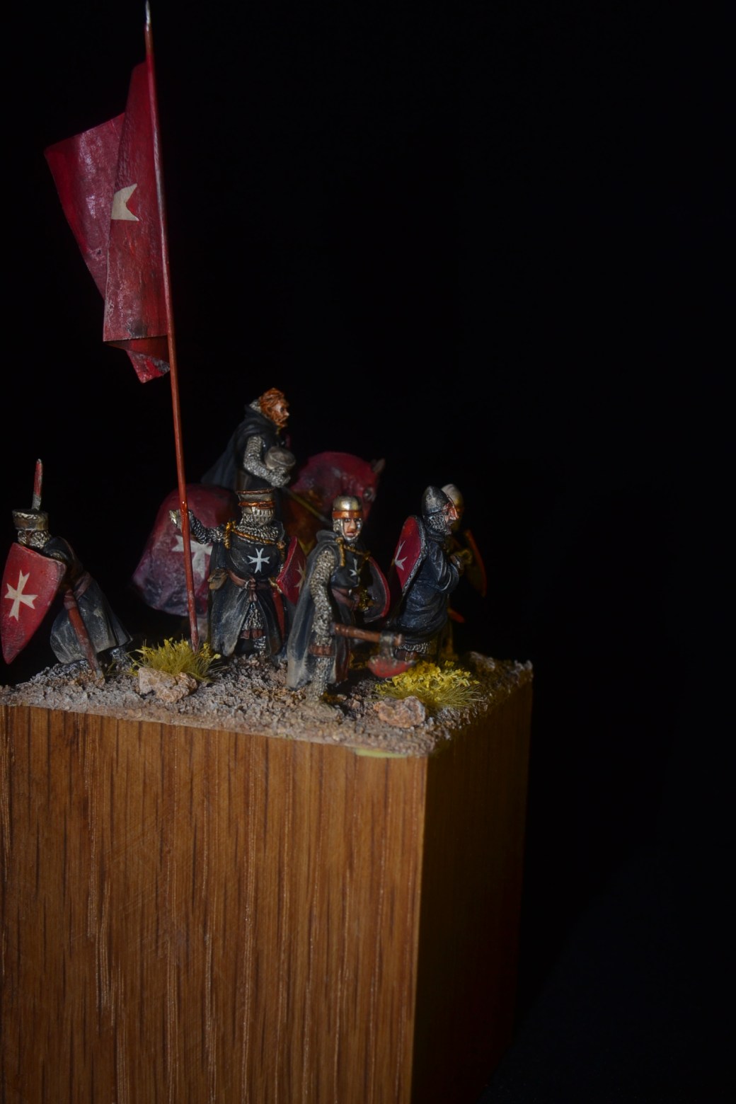
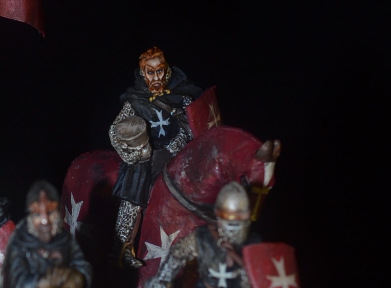
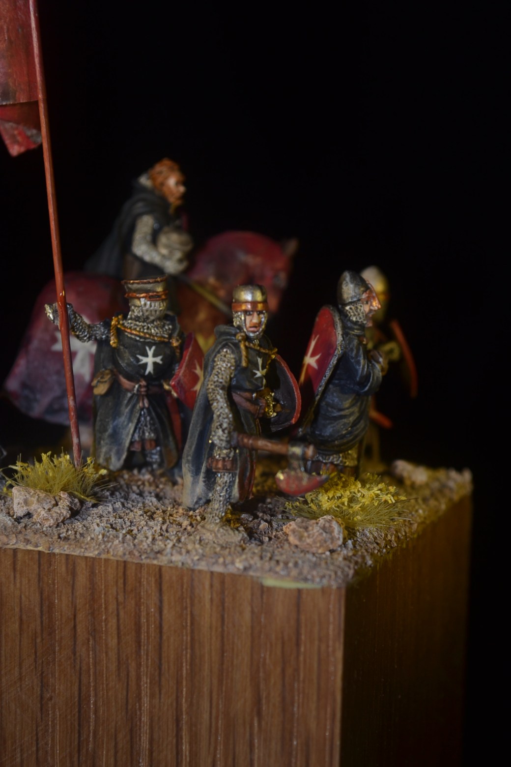
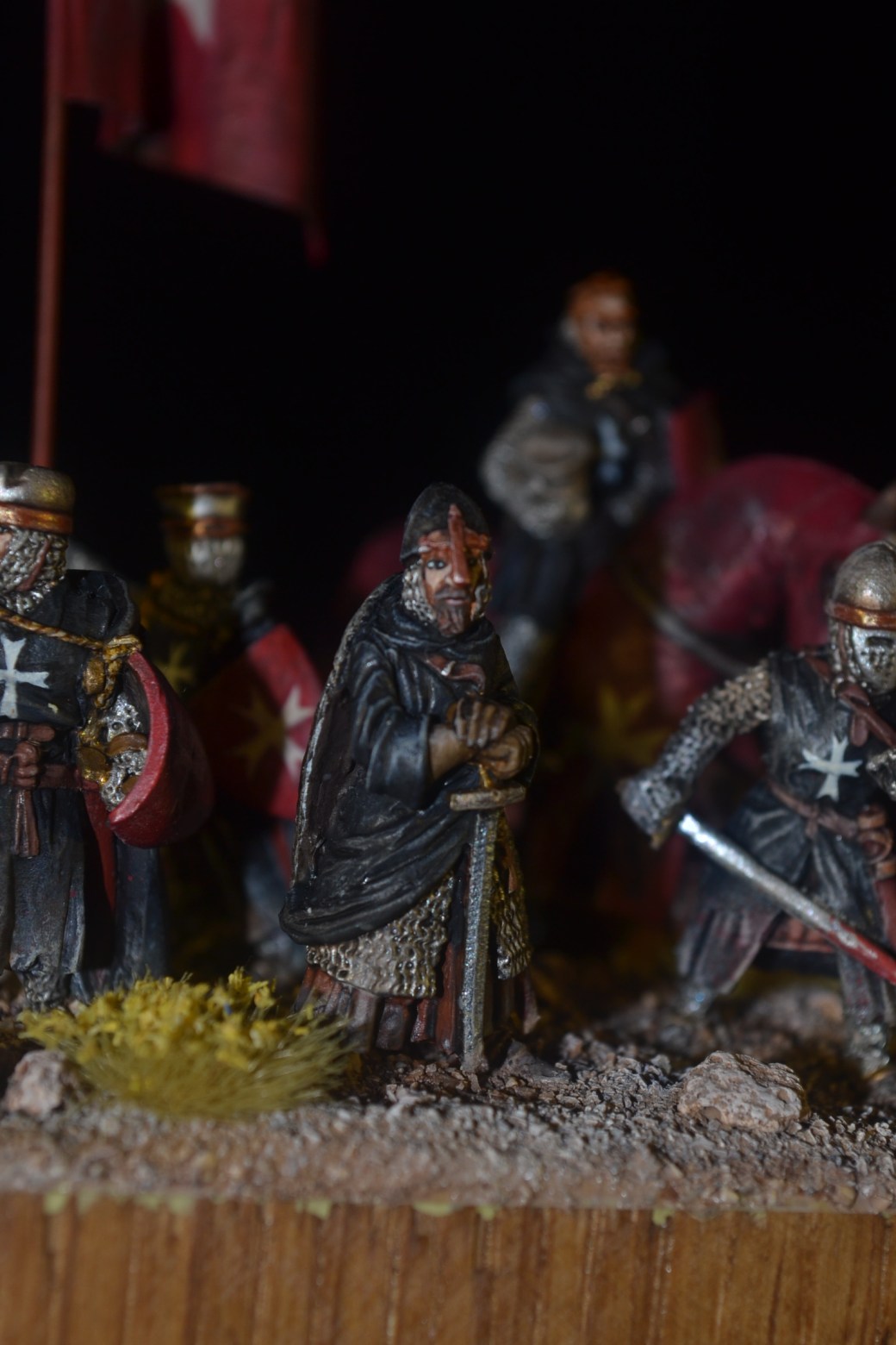
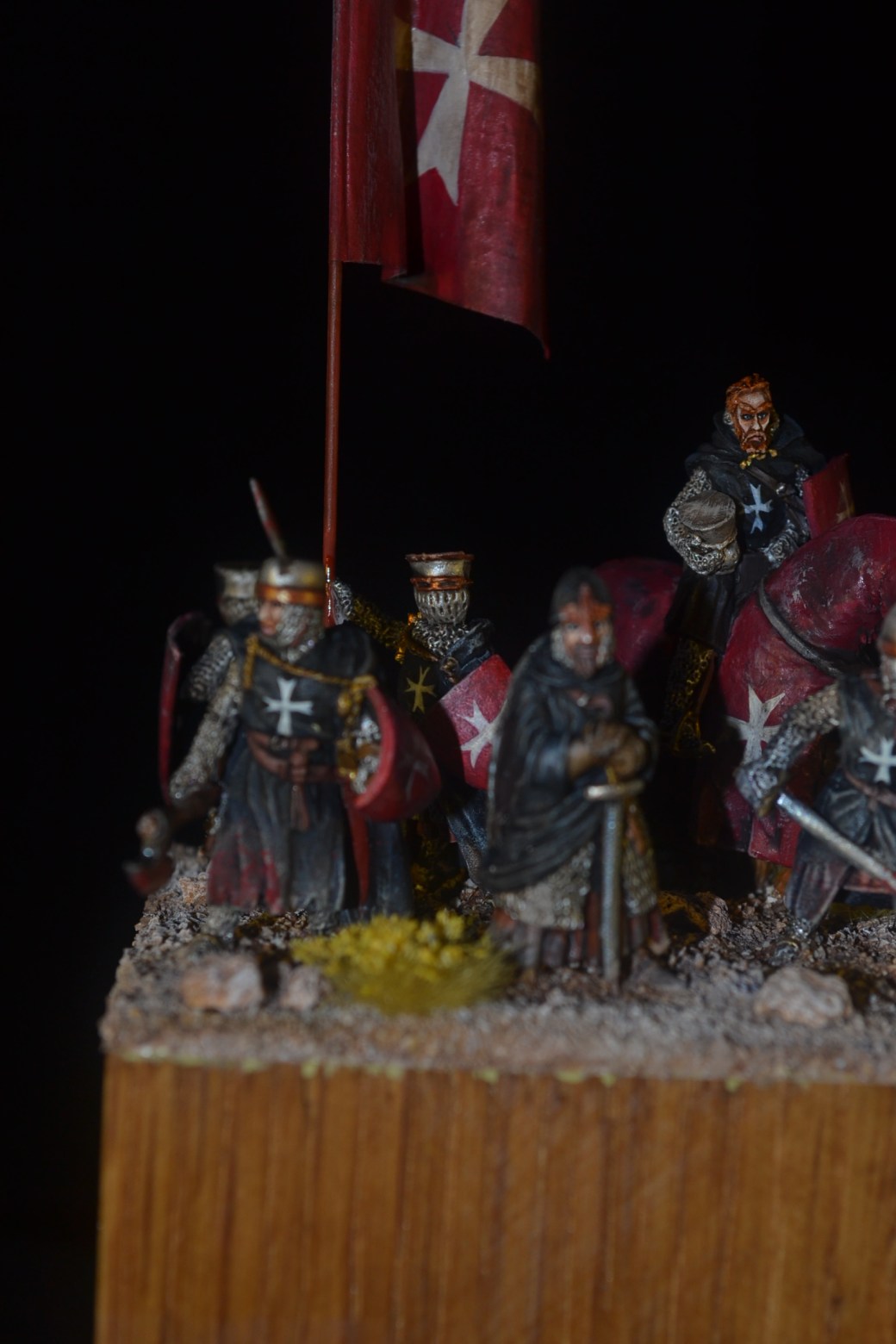
Just recently my modelling has mostly been all about knights and to be fair I have enjoyed it. The Baron’s War figures from Footsore Miniatures are excellent and I will be keeping a close eye on the range as it continues to expand. Included in the range are some mounted knights and I decided to buy one and feature it in another little diroama. You might recognise the figure as a foot knight I have shown in a previous post.
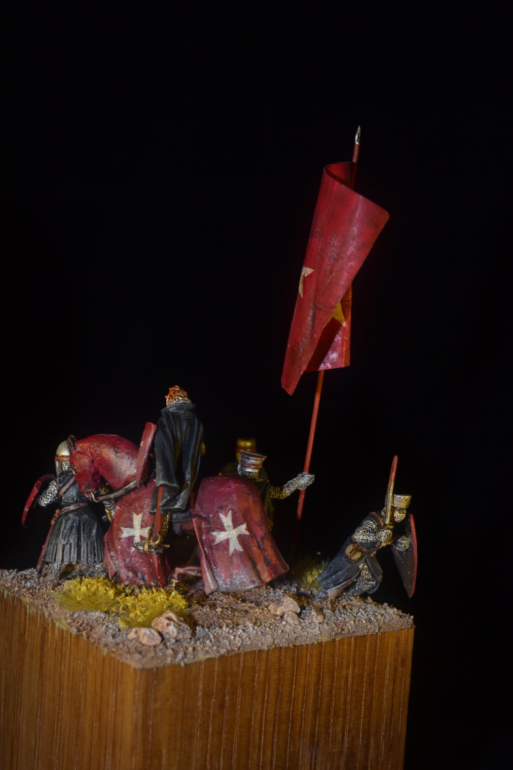
Since I completed and posted my previous diorama I discovered some interesting information on Hospitaller Knights. Long story short it seems that black tunics and shields both with white crosses owes more to artistic licence than fact. It would seem that black tunics with white crosses are fine but the shields were in fact red with white crosses. Based on this discovery I felt compelled to do another diroama sporting the correct colour scheme.
The model provided another opportunity for plenty of freehand, albeit only crosses, but getting size and spacing consistency proved a challange. The flag was another one made using Japanese writing paper and the method described in my other diorama post. Overall a simple affair, just a few knights standing around together really. That said it’s probably my best bet for an entry into Azazel’s Jewel of July.
Images below.
TIM


That is really nice, Dave! 🙂 The whole here is definitely greater than the sum of its parts!
LikeLiked by 3 people
Thanks John, glad you like it. 😊
LikeLiked by 2 people
Lovely work mate, nice level of griminess! I always think that ‘Knights on tour’ should look a little worn around the edges
😊👍
LikeLiked by 3 people
Cheers Alex. Some people like their figures looking brand new and nice and clean but I much prefer wethering where I think it appropriate. Love the line “Knights on Tour”! 😊
LikeLiked by 3 people
Very nice Dave, they look great together.
LikeLiked by 3 people
Thanks Steve.
LikeLiked by 1 person
Amazing work. I love the details, the weathering and the movement on the banner. Great composition!
LikeLiked by 3 people
Thanks mate glad you like it. Working on something little and quite different that I might also submit for your Jewel of July. Hopefully it will be finished for next week. 😊
LikeLiked by 4 people
Those look fantastic- prefer the correct colour scheme.
Cheers,
Pete.
LikeLiked by 4 people
Thanks Pete. If nothing else I like that the red provides a splash of colour.
LikeLiked by 2 people
Alex is so right about the griminess and battle scared look, you have nailed it again and as for the grouping, perfect .One problem that is constantly mentioned over on the PSR is flag size ,they are always complained that they are too small so its good to see you have made yours an appropriate size. I would imagine they needed to be large so in the heat of battle your loyal troops could identify it and rally to it like you have done on the little beauty, full marks Dave, I love it!
LikeLiked by 3 people
Thanks Pat glad you like the model. I’m no historian but I agree with you as to why the flags would be large, they would need to be visible over a large battle area you would think. Whether I got the sizing right I am not sure but it felt right.
LikeLiked by 3 people
Oh ,and I forgot to say the red is very impressive.
LikeLiked by 2 people
looks like they have just returned from foreign lands which were dry and barren, they could be ‘ The Baron Knights’, again you have delivered a great group of people, nicely painted with that narrative in tact, great work..
LikeLiked by 2 people
Thanks Steve but you have dated us both with your reference to The Baron Knights! 😊
LikeLiked by 2 people
I actually went to see them in Nottm back in 19 hundred and frozen to death, good night as I remember..
LikeLiked by 2 people
Superb mate. One of your best. Your freehand always blows my mind. The photography on this one is exceptional mate. I love the weathering on everything and, of course, I love the blood. You should try Games Workshops technical paint called “Blood for the blood God”. I’ve also used red food dye for blood which works well for a dried blood look. Again, brilliant work mate.
LikeLiked by 2 people
Cheers matey, glad you like this one. The footsore figures take some beating they’re very good. That said time to move on from knights now I think. Might do the odd one here and there though. Will check out the technical blood paint, I’m sure I saw a video on it a while back on a website. Will try and find it again and make a note to buy some.
LikeLiked by 2 people
Ditto to what IRO wrote on all points, especially the freehand. I also must add that your faces are so damn good, especially the eyes.
LikeLiked by 1 person
Cheers Mark. For me the faces are the number one thing to get right and makes so much difference. They are far from perfect but a lot of practice has gone into getting this far.
LikeLiked by 1 person
Really awesome work! Just like the previous dio, these minis are just made for this kind of scene and have so much character. I like the way you weathered these and the change in uniform colors look awesome too. Very inspirational work and I WILL have to try and paint something from the crusades now because of your awesome dioramas 🙂
LikeLiked by 1 person
Thank you. It is a great hisrorical period. I am sure you will enjoy it if you give it a go.
LikeLiked by 1 person