

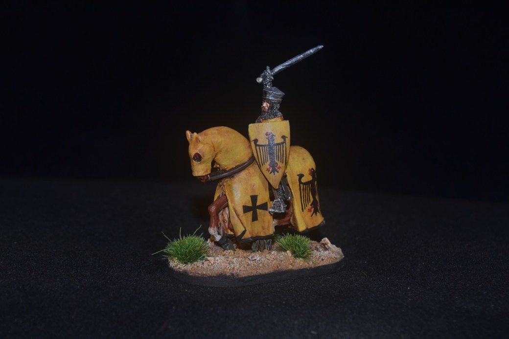
Back in June (where did the summer go?) I painted up this Footsore Baron’s War figure with a bit of freehand painting on the shield to depict a knight by the name of Sir John De Belloows. At the time I did it I thought I’d quite like to have another bash at the heraldry at some point and over the last week I finally got around to doing so.

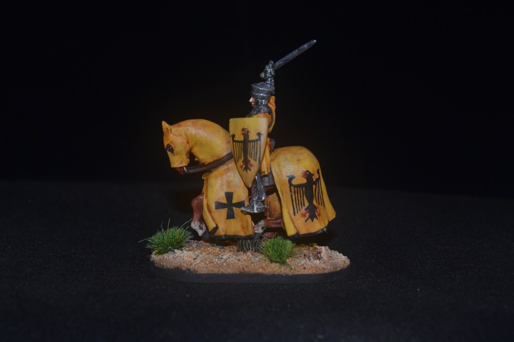
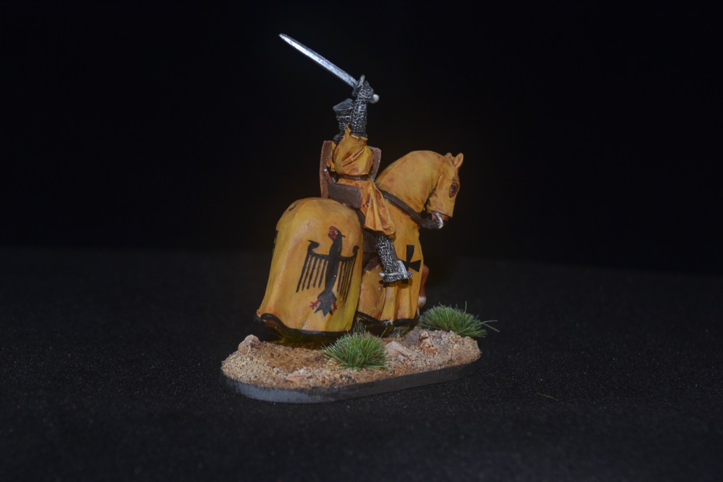
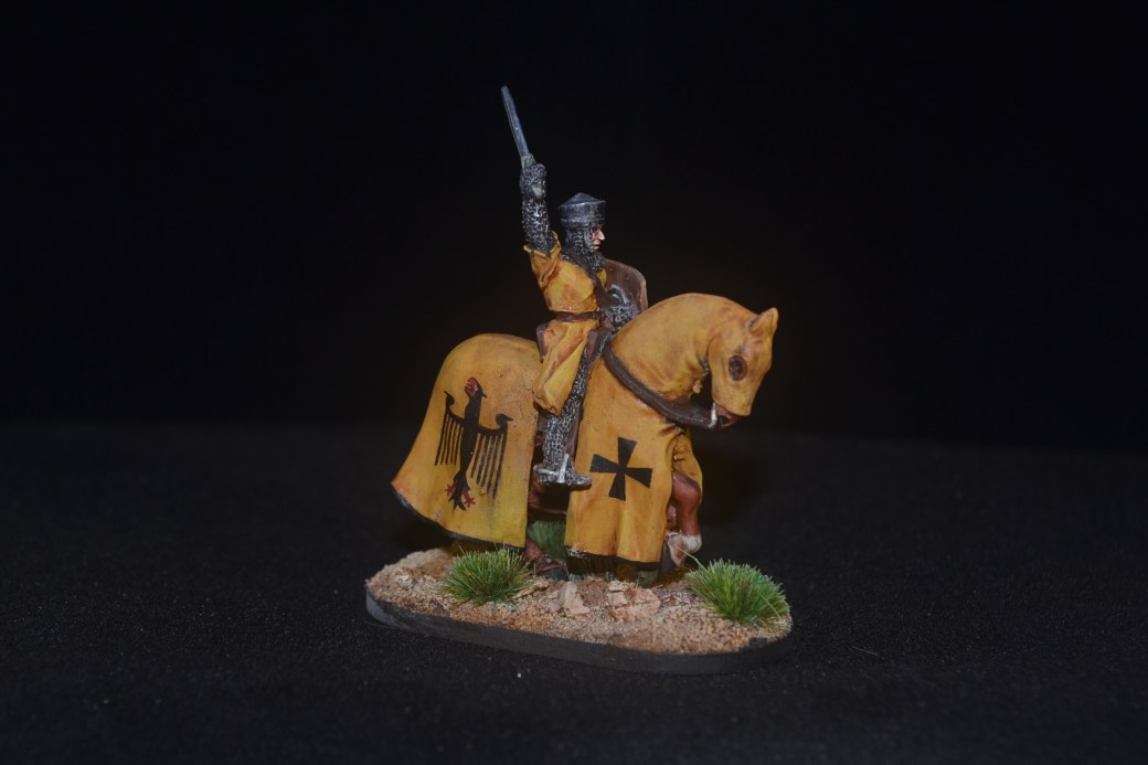
I decided this time that I would have a go at applying the heraldry to a mounted knight. I also chose to go with a different colour scheme, yellow instead of white, and a slightly different design. As you can see there isn’t much to choose between them other than the head really. Having done three paint jobs of the Eagle(?) – two at the back of the horse and one on the shield – I couldn’t be asked to do two at the front of the horse so I went for crosses instead. Lazy I know.
I really have no idea if there is a real knight with anything close to this heraldry, if there is then it is purely coincidence on my part. Accordingly the knight was in need of a name so once again I returned to my family tree for inspiration and thus settled on the name of my great grandfather, James Kimber.
Images of Sir James below.
TIM


You are going to have quite the army! Nicely painted.
LikeLiked by 4 people
If I complete all the figures I bought then it should be over a 100 strong. I don’t have them all and more are due out so at some point I will have to make a decision on where I go next. 🙂
LikeLiked by 2 people
Lovely freehand mate, he’s spot on!
LikeLiked by 2 people
Thanks Alex, the freehand is the fun bit but it can be frustrating too! 🙂
LikeLiked by 2 people
Very nice, Dave! 🙂 Sensible move not painting the eagles on the forward quarters – it’d be too easy to compare the front and rear ones on each side and make it more difficult to get a result you’d be happy with, so opting for crosses makes it a lot simpler. That said, the eagles do look really good! In some cases I’ve seen in the past, the heraldry at the rear on the horse is not always repeated at the front anyway (not that I’m any sort of authority on this mind you).
LikeLiked by 7 people
Thanks for that John, what you say makes sense so I’ll go with that in future rather than explain it away as laziness! Having looked at a good many images you are right about the heraldry often being different at the front and back. What I don’t know either is why and if there are proper combinations. Something else to look into as and when. 🙂
LikeLiked by 2 people
Great work TIM, you have really pulled off that design, doing it 3 times and them all looking similar is great work!
LikeLiked by 3 people
Thank you. The more complex the design the harder it is that’s for sure. Whether I’ll ever take on something more complicated remains to be seen but I think I got away with this one. 🙂
LikeLiked by 3 people
I like the eagles, the freehand work has progressed nicely!
LikeLiked by 4 people
Thanks Eric. 🙂
LikeLike
Great work on the knight Tim, I think you may have stumbled on an actual Knight, as I swear I’ve seen that colour scheme and heraldry before.
LikeLiked by 3 people
That would be a nice coincidence Dave if I have. I’ll try and do some research later and see what, if anything, I can find. 🙂
LikeLiked by 3 people
Ah it’s the Bundesadler! Germany has conquered the isle, if not directly, but via heraldry! Even the background color is the same! 😉 Really dig it! Also love the other knight, I’m still looking to purchase for myself, you’ve done a lovely job making him look like he would fit right into the Teutonic order.
LikeLiked by 3 people
Thank you. I’m pleased with how he came out. I must make a conscious effort to look more at European knights and heraldry for further inspiration. 🙂
LikeLiked by 3 people
Fantastic work again, the yellow looks great and the heraldry is amazing.
LikeLiked by 5 people
Thanks Matt glad you like it. 🙂
LikeLiked by 2 people
Wow Dave. You have such a steady hand. Looks great.
LikeLiked by 5 people
Cheers IRO but check out Blazzing Saddles and you’ll get an idea of just how steady it is! 😉
LikeLiked by 2 people
My thought was the heraldry looks very Teutonic…so maybe the Germanic links to the houses of ol’Blighty started a little earlier than the royals like to admit 🙂
LikeLiked by 4 people
I never thought of it as Teutonic at the time but a now very much of the mind that the Eagle design is Germanic. As for the Royals, they put it about so much (have they stopped?) I suspect that could well be likely.😉
LikeLiked by 1 person
Lovely work as always mate, it’ll be a shame to rank these chaps up as you loose some of the impact of your lovely heraldry!
Cheers Roger.
LikeLiked by 4 people
Cheers Roger. Unless I ever do decide to dive into a game I suspect they will only be ranked up for photo’s. 🙂
LikeLiked by 2 people
Wonderful swork- the guy in black with the full face mask looks quite sinister but the mounted knight is a thing of beauty.
Cheers,
Pete.
LikeLiked by 3 people
Thanks Pete. 🙂
LikeLiked by 1 person
Great stuff! I never find yellow an easy colour to work with but you’ve done a lovely job here.
LikeLiked by 3 people
Thank you. As you say, yellow isn’t an easy colour but I found it much better once I started undercoating with a sand colour First.
LikeLike
Once again, he looks fantastic. The eagle really looks great on the yellow cloth.
LikeLiked by 3 people
Thanks mate, I was quite pleased with how it turned out in the end.
LikeLiked by 1 person
Reminds me of old German Eagles like these: https://www.germanstamps.net/wmr-rpst-1924-eagle/ Again, these are amazing Dave. Please keep them coming !
LikeLiked by 3 people
Thanks Mark and that’s a great link to some excellent images too. 🙂
LikeLiked by 1 person
Sorry for the belated comment this time around! This guy looks fantastic. You can’t go wrong with yellow and black and I like how you dirtied up the yellow as well. I don’t know if any knights had it but seeing this makes me want to see someone with a raven or crow heraldry. I think that would look pretty cool and fit the personality of some knights pretty well too 🙂
LikeLiked by 2 people
I agree, the two colours work well together and there is something quite intimidating in the scheme along side eagle heraldry too I think.
LikeLiked by 1 person
Great work on all these Baron’s War figures – really nice 🙂
LikeLiked by 2 people
Cheers mate, glad you like them. 🙂
LikeLiked by 1 person
Brilliant Dave !! so good I wouldn’t even think about trying to paint those amazing images !!
LikeLiked by 1 person
Thanks Pat, glad you like it. 🙂
LikeLiked by 1 person