

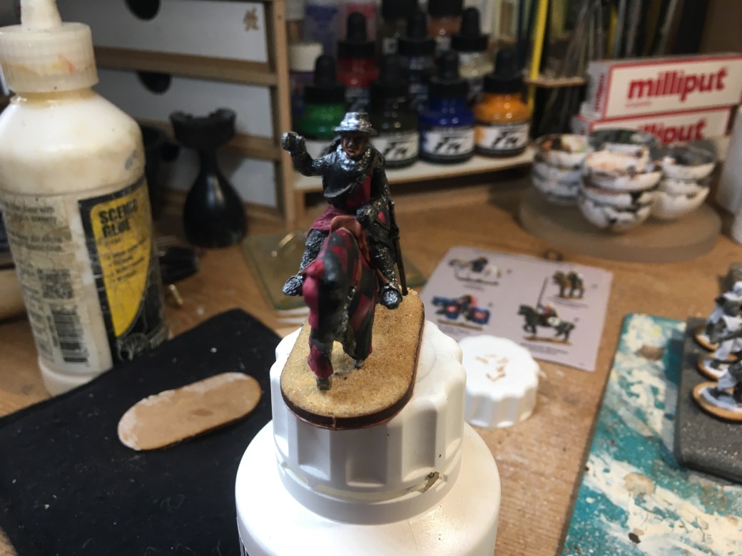
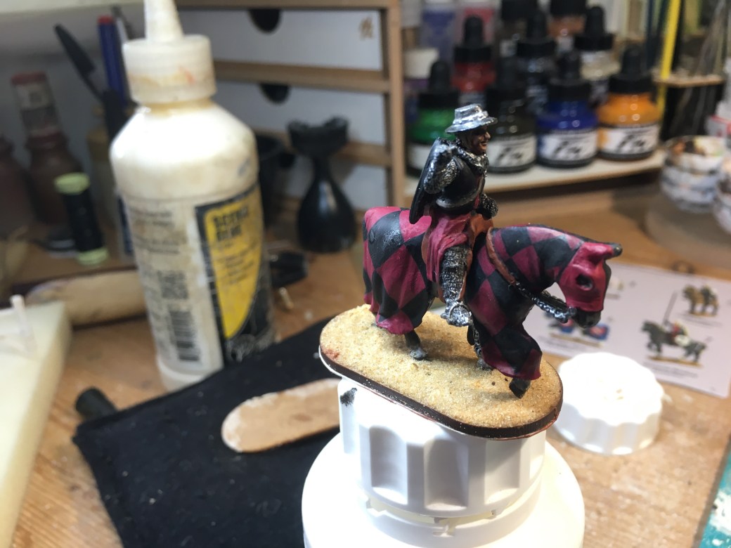
The last of the four knights whose mounts had Comparisons. Although it is much slower to paint these figures I much prefer them to the plainer horses. They feel more unique, which I guess they are, and as such the end result is more rewarding and personal.
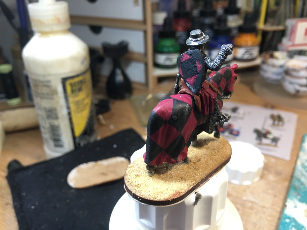
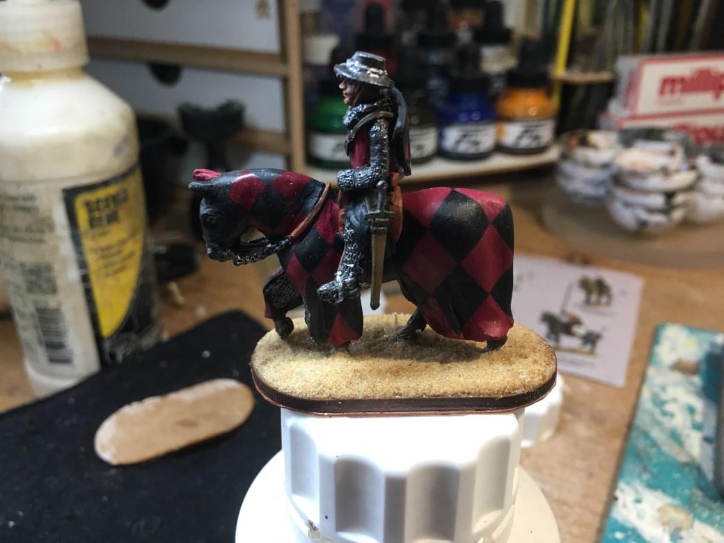
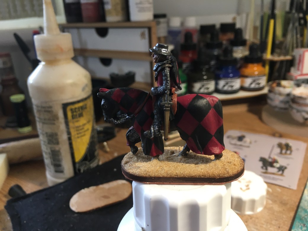
I decided I’d go for red and black as a colour scheme and chose a large diamond pattern to paint. Compared to the much smaller check pattern on a previous knight this was much more straight forward.
TIM

Looking great, you may say it was easier to do butbit does not look so.
LikeLiked by 3 people
Thank you. The design and painting does require patience but the larger shapes are far less fiddly than those little squares! 🙂
LikeLiked by 2 people
Excellent looking knight Dave, the diamonds look very crisp, which can be a pain ! LOL
LikeLiked by 3 people
Cheers Dave. Still fiddly but easier than those squares!
LikeLiked by 2 people
Honestly, I prefer the plainer horses, as you do such an amazing job painting horses. But I can imagine it’s a bit easier to paint these, plus you get to play around with patterns which you’re also great at!
LikeLiked by 4 people
Thanks mate. It’s the playing around and being creative which I like. 🙂
LikeLiked by 1 person
Excellent work sir 🤘
LikeLiked by 3 people
Thanks Alex. 🙂
LikeLiked by 1 person
Very nicely done, Dave! 🙂 That colour scheme has come out well!
LikeLiked by 3 people
Thanks John. 🙂
LikeLiked by 1 person
Superb work.
Cheers,
Pete.
LikeLiked by 2 people
Cheers Pete. 🙂
LikeLike
I always have mixed feelings about horses with comparisons. Done well, as you’ve demonstrated here, it looks fantastic, but I always feel that if your freehand skills aren’t top of the line then you’re setting yourself up to screw up. Of course this is probably just a result of my own attempts (and failures!) with painting horses back in the distant past (and yes, I do still have some horses on the painting desk… and yes, I’m still avoiding them…). Anyway, once again you’ve knocked it out of the park with this one! How many knights are there still to go now?
LikeLiked by 2 people
Thank you. I know what you mean about getting them right. I’ve seen lots of mounted Baron’s War knights on Facebook posts, some look great but others look dreadful despite the best efforts of the painter. For the same reason I avoid figures, especially bigger than 28/32mm, of “real” people/characters, anything less than a damn good likeness doesn’t look good. Only one more knight to go and then I can get back to basing and finishing this one. 🤗🤗
LikeLiked by 1 person
I think these give you a greater opportunity to express yourself! I really like the red and black pattern you used here too. It really came out looking nicely. You don’t have too much further to go now, I wouldn’t think 🙂
LikeLiked by 2 people
Yes, it is nice to do your own thing once in a while. 🙂 just one mounted knight to go now and then it’s back to base work and finishing this one off finally. 🤗
LikeLiked by 1 person
Nicely done as always mate, and much simpler than the smaller check I imagine (and we all like a big cheque 😉
Cheers Roger.
LikeLiked by 2 people
Haha, Cheers Roger. 🙂
LikeLike
Excelled yourself again mate, cant beat you when it comes to checks!
LikeLiked by 2 people
Glad you like it Pat. 🙂
LikeLiked by 1 person