

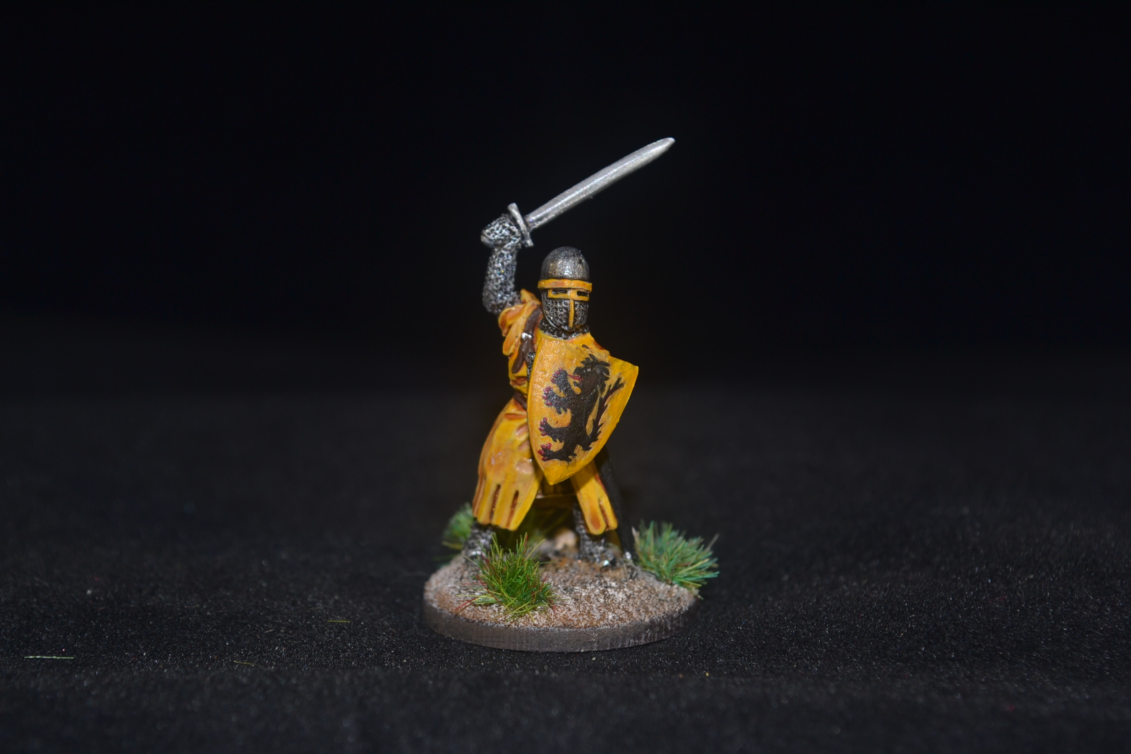
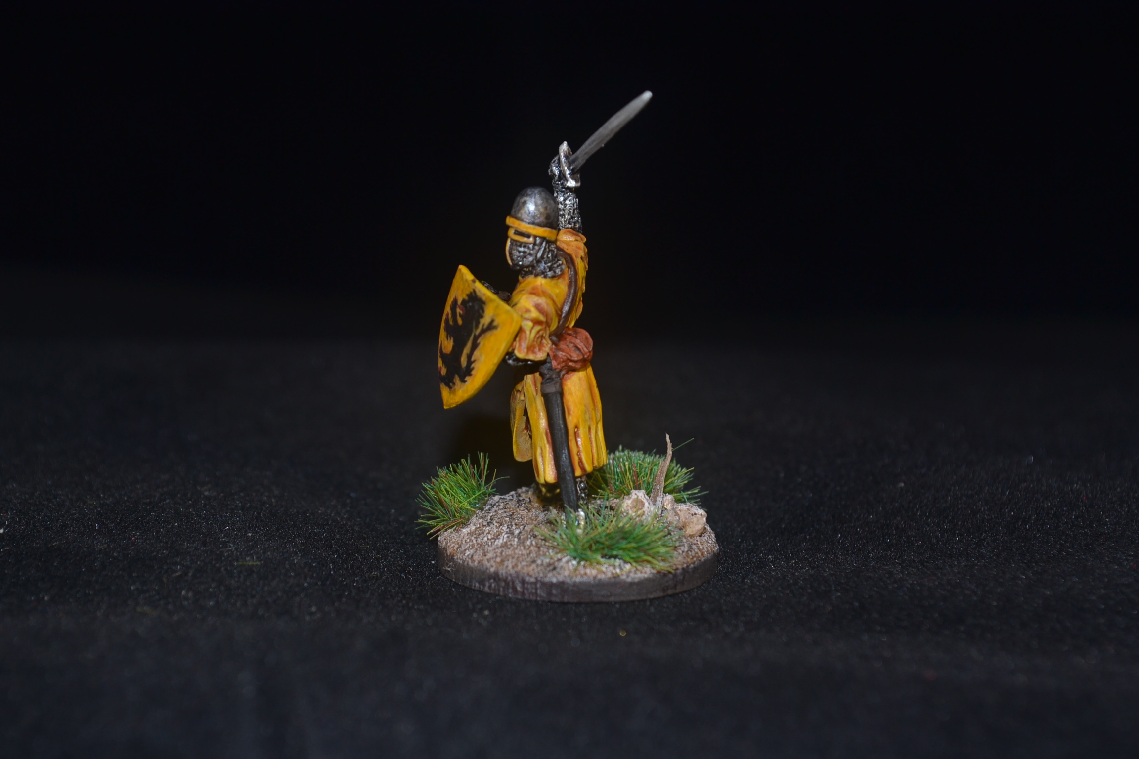
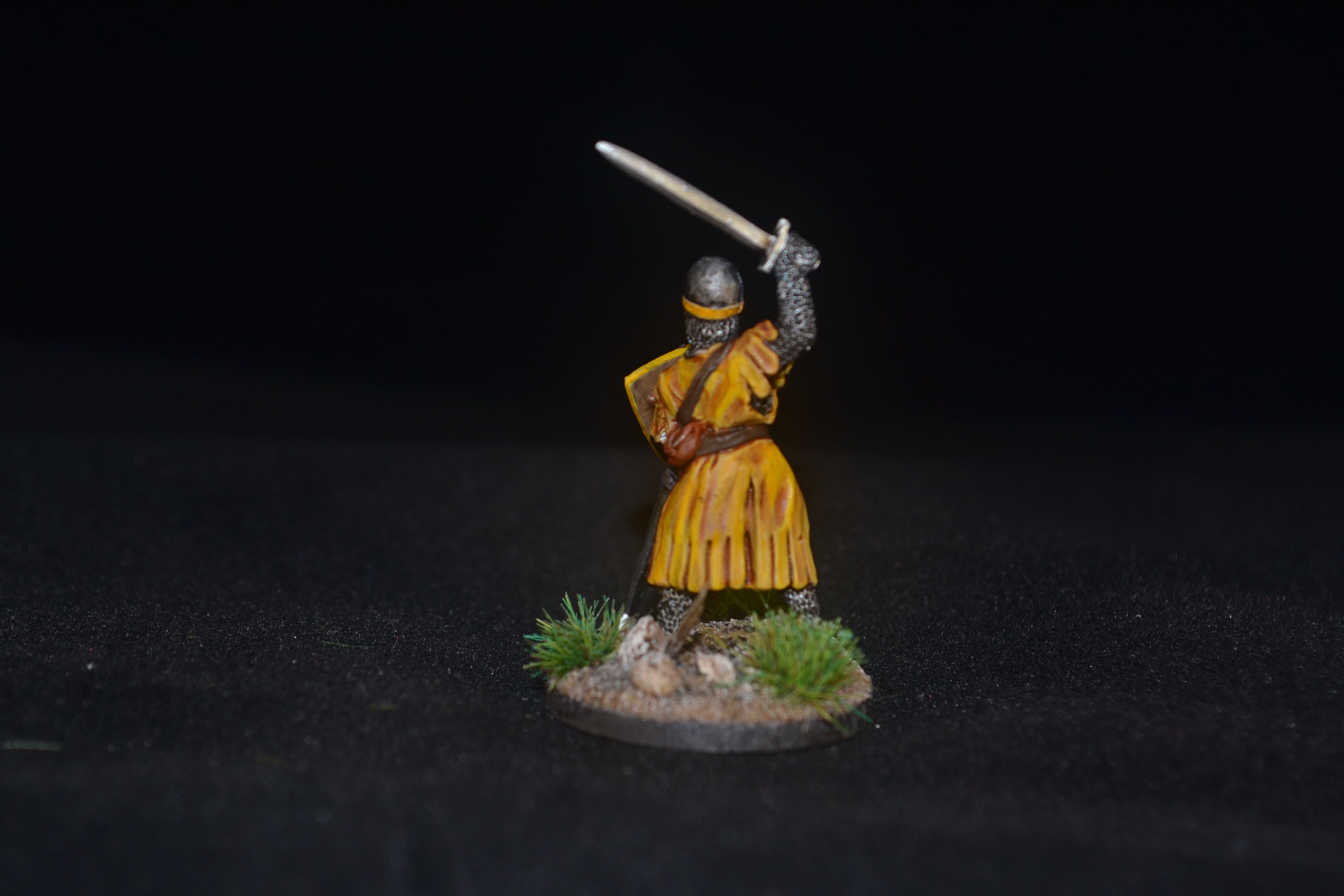
This week we have another 28mm foot knight for my slowly growing Baron’s War army – Sir Phelip de Welles.
I have mixed feelings about this one.
On the positive side I’m pleased with the yellow. A great colour but so often dreadful to paint with. Better undercoating seems to hold the key and I am much happier with the results I’m getting these days. Might just be my eye but there seems to be a bit more depth to the end result. Whatever the Science I am pleased with how it came out.
On the positive/negative side I have mixed feelings about the heraldry result on the shield, my first attempt at painting a Lion Rampant. As a first attempt I’m pleased but the head isn’t quite right so that’s left me a little disappointed. I think what concerns me more was not being able to see how to put it right. But for the head I’m pleased but it is clearly something I need to practice a lot more. I would also add that I found using flow aid medium essential.
One of the challenges with the heraldry was how to break the design down into manageable chunks given the very limited amount of space available on a 28mm shield. In this instance it was all about getting a basic skeleton shape for the lion and then bit by bit fleshing it out. Once I got the skeleton form right it became much easier. I thought YouTube would have plenty of useful tutorials but I found it sadly lacking. I did manage to find something very basic which proved interesting and served my purpose but I had hoped for more. Perhaps I just didn’t put the right search criteria in.
Images of Sir Phelip below.
TIM


Looks really good, Dave! 🙂 In the past, with such things as the shield (or tank markings for me) I’ve tended to roughly paint the design to fit the space and then corrected the design and tidied it up afterwards. They virtually never come out right on the first pass for me!
LikeLiked by 3 people
Thanks John. I tend to operate much like you with a sketch before hand but I just couldn’t seem to get the image to look more like the one I was copying from. More practice is the order of the day. 🙂
LikeLiked by 1 person
Wonderful looking Knight TIM, there probably wasn’t many tutorials as most people opt for transfers ! I think you have done a great job on the lion, also the rampant lion looked slightly different depending on where you were from, so one from France would have a different style to one from Ireland
LikeLiked by 3 people
Thanks Dave. Good point about transfers, that hadn’t occurred to me at all and another fascinating fact which you have presented me with too on variation, cheers for that. 🙂
LikeLiked by 1 person
This looks great TIM the yellow is spot on well done there it certainly can be hard to paint!
On the lion I really like it head included.
LikeLiked by 2 people
Cheers mate. Overall I’m pleased with this one but the challenge is there to improve for next time. 🙂
LikeLiked by 1 person
He looks great, and lovely work on the yellow too 😉. The lion looks good to me, I can see what you mean about the head, it might be the muzzle is too definite and could be sloped more into the forehead? but that might just be the photos. Cats face’s are difficult, I had a similar problem with my Panthor (he man) sculpt last year. 🐱
Cheers Roger.
LikeLiked by 3 people
Cheers Roger. I’m sure there is something in what you say and the challenge will be to get it right next time …. or the time after that or …. 🙂
LikeLiked by 1 person
Transfers might be your friend in this project. They sure are for me! Painting details so small is such a chore. I don’t kbiw how peopke paint stuff that looks right! In with Roger, a bit of touch up to make it more leonine might be the trick. A lions face is so distinct.
LikeLiked by 3 people
Transfers are an option but one of the aims of the project was to challenge my freehand so they are definitely a last resort. I’m up for the freehand challenge though so we will see how things turn out going forward 🙂
LikeLiked by 1 person
Kudos to you then! You have all my respect! My hand is… Less than useful. I can pull off a rune or basic shape. My animals are totally useless. Cant wait to see more then, sir!
LikeLiked by 3 people
I should have added that setting myself a challenge and achieving it aren’t necessarily the same thing! 😉
LikeLiked by 1 person
I think he looks brilliant mate – you should be pleased with that lion!!
LikeLiked by 2 people
Thanks Alex. I’m happy with him as a first attempt but I would like to improve on it if I can.. just need to get my head around how and then practice some more. 🙂
LikeLiked by 2 people
Have you considered that you got the lion spot on first time, and it was God who just couldn’t get it looking quite right? Sir Phelip certainly looks good to me. 🙂
LikeLiked by 2 people
I hadn’t but the more I think about it the more I reckon big G didn’t have a clue when it came to lions. 😉
LikeLiked by 2 people
It’s what comes of rushing things, trying to do the whole job in 6 days was always going to be cutting it fine. Should have given himself more time! 😉
LikeLiked by 2 people
Agreed . Maybe he was a women as some would have us believe? 😉
LikeLiked by 2 people
Aye, men work ’til down of sun but a woman’s work is never done. Trust me, saying that’s a result of poor time management never goes down well…
LikeLiked by 2 people
😂😂
LikeLiked by 1 person
I think the lion looks fine. Free hand stuff is hard and I think you have done great for a first go
LikeLiked by 2 people
Cheers mate I appreciate that. 🙂
LikeLiked by 1 person
Well I’m blown away mate. I think the shield design is great. You’re right about the yellow, definitely more depth.
LikeLiked by 3 people
Thanks IRO, I’ve always said you know what you’re talking about 😉. Take care mate. 🙂
LikeLiked by 2 people
Great work- really like the shield design- I can’t freehand anything like that so go for transfers every time.
They yellow came out really nicely too.
Cheers,
Pete.
LikeLiked by 2 people
Thanks Pete. Nothing wrong with transfers but I’m just keen to try to master some freehand. Plenty of room for more practice still though. 🙂
LikeLiked by 2 people
Looks great to me, mate! I have to think most people rely on transfers instead of painting this type of thing by hand both to save time but also because many are intimidated by freehand. I think the more you practice designs like that, the better and better results you’ll achieve as well.
LikeLiked by 2 people
Spot on mate. No question transfers save time but it’s a personal thing trying to paint them instead and only practice will improve things at the end of the day. 🙂
LikeLiked by 2 people
It looks great, as for the shield, I reckon it looks spot on. I was looking for some images for the Holt Roman Empire and the two headed eagle on one of the banners was totally different to what we would get as a transfer.
LikeLiked by 2 people
That’s a very good point Steve and one I’ll bare in mind. What I really ought to be doing is comparing the artist impressions of today (and likely transfer image) versus what thy really looked like. They can’t of all been artists back in the day can they? 🙂
LikeLiked by 2 people
Similar things happened in re-enactment…people want really posh stuff, nice kit and awesome artwork on shields etc. Artists and films use them as reference and then it becomes the norm and the circle goes around again. A lad I knew did loads of research into Napoleonic uniforms and did it accurately based on the original kit he had in his hand no-one wanted anything to do with it as it wasn’t ‘good’ enough. So I say well done for an accurate medieval shield design …. says the person who used transfers for his Greeks… to be fair there were 120 of them so I did it for speed …honest. I did however do hand drawn livery on my 10mm medieval chappies.
LikeLiked by 1 person
Cheers Steve, really interesting and valid comment 👍.
LikeLike
He looks excellent! The yellow robes (and I’ve had crap experience painting yellow recently) are bright without looking weirdly yellow, and the heraldry on his shield is outstanding given the tiny space you had to work in. Any chance of a group shot of your knights, or do you have more to come?
LikeLiked by 1 person
Thanks Matt. Since I started adding undercoats on top of the primer my yellows have come out much better. As for group shots that’s something I’ve got to do. Having bought a hundred figures or more I’ve been painting very randomly for variety more than anything. The figures though come in packs of 4 mostly and soon I will have one or two full sets of 4 done and aim to post them as a small group shot. Later on I’ll look to do something grander. Well that’s the plan! 🙂
LikeLiked by 1 person
I think you are judging yourself too harshly. For a hand painted lion it looks excellent, and even if it is a bit out or proportion or you don’t like the head, maybe Sir Phelipe has a fantastical beast upon his shield rather than a mere lion?
LikeLiked by 1 person
Haha, that’s the way out of it, go down the mythical beast route. In all honesty the only reason I’m not 100% happy is because it doesn’t compare as well as I would have liked to the image I was copying. Chuck that image away and I’m not so disappointed. 🙂
LikeLiked by 1 person
Well done with the yellow mate, I always find it a bastard colour to paint for some strange reason, your a bit harsh on yourself Dave,the lion looks pretty spiffy to me!
LikeLiked by 1 person
Cheers Pat. I found painting yellow a lot easier when I painted over an undercoat of Vallejo Model Color Iraqi Sand. 🙂
LikeLiked by 1 person