

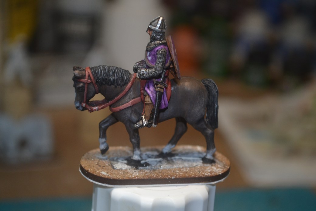
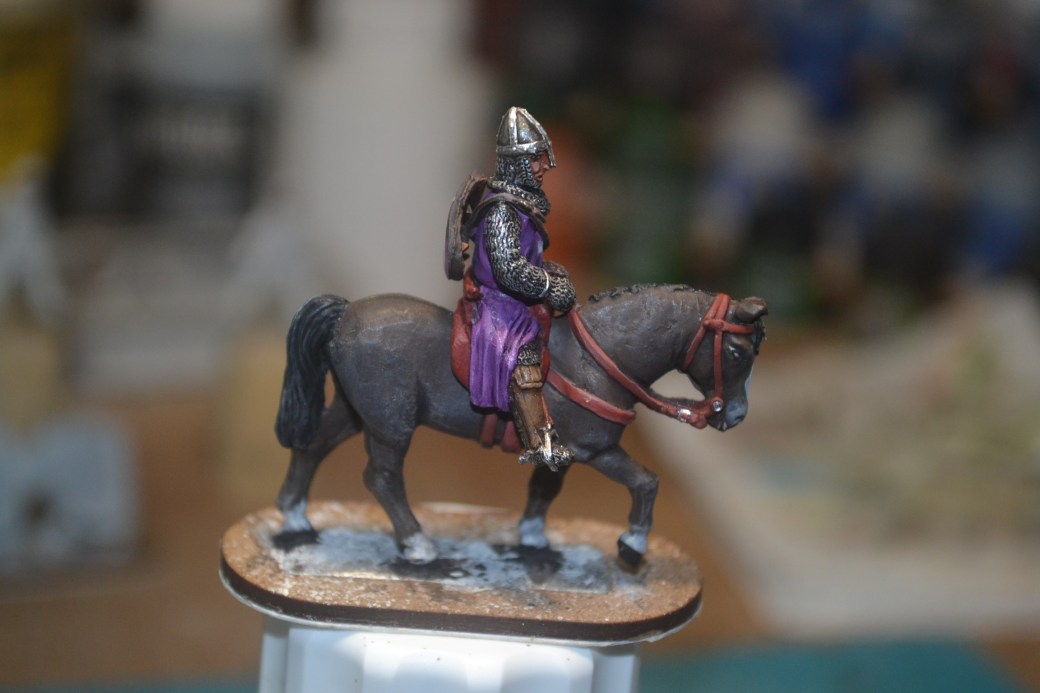
This week sees my second mounted knight done, well except for some weathering and the base which as explained last week will get done later on.
Once again the heraldry is based on nobody in particular, I’m far more interested in the aesthetic of the diorama than historical accuracy to be honest and I’m therefore keen to add colour variety where and when I can.
As with the previous knight, and as will be the case for the other ten figures when they follow, this is a miniature from Mirliton, an Italian based company.
Little else for me to say other than that some images appear below.
Next week, and while I’m in the mood, I shall crack on with another mounted figure.
TIM


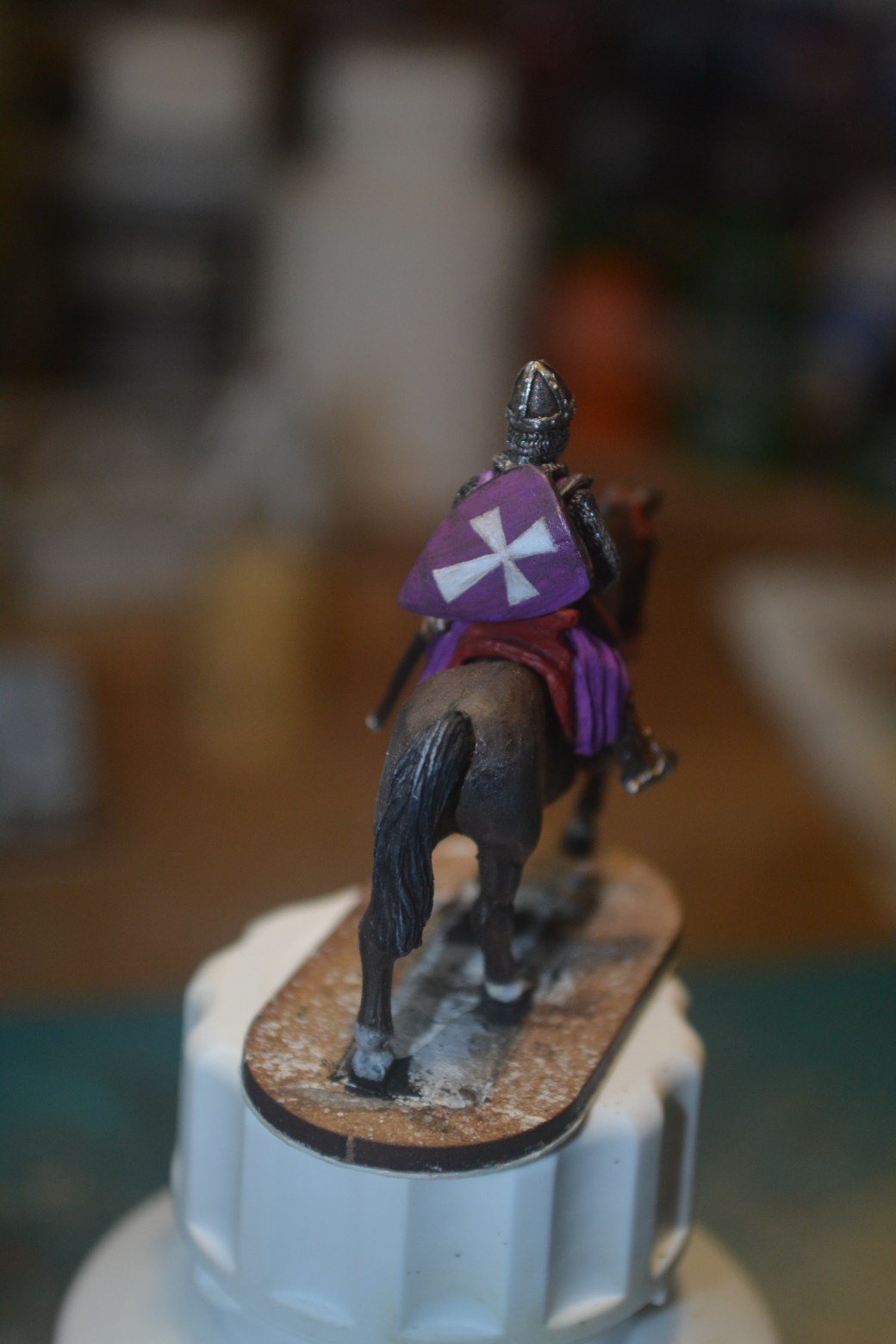

Very nice Dave, love the purple and your work on the white crosses is again magic!!
LikeLiked by 3 people
Thanks Pat. It’s a nice bright colour which will hopefully stand out once the little chap is properly based.
LikeLiked by 1 person
Great work, I must say I really like the face on this one and the helmet. Its going to be an amazing dio when it’s done!
LikeLiked by 1 person
Thank you. I’m looking forward to getting these figures done so I can get stuck into the base work again and see how they look myself! 🙂
LikeLiked by 1 person
Very nice, a knight to remember right enough!
LikeLiked by 1 person
I’m told it’s the size of the weapon that lives longer in the memory! 😉
LikeLiked by 1 person
😂
LikeLike
Great looking knight TIM the colour choices and details work well, and contrasts well from the dark colours of the horse
LikeLiked by 1 person
Thanks Dave. Hopefully I can achieve that on the others too. The overall aim is to make the mounted figures, well some of them at least, as eye catching as I possibly can.
LikeLiked by 1 person
Gorgeous purple but I really love how you’ve managed the metals too – I can almost hear that chainmail 😊
LikeLiked by 1 person
Thanks Alex. It’s quite a striking colour and hopefully it will stand out nicely. 🙂
LikeLiked by 1 person
The purple surcoat really works, and the hand painted heraldry is great!
LikeLiked by 1 person
Cheers Eric. I’m hoping to make each figure as individual as I can and varied heraldry and colours will be key.
LikeLiked by 1 person
Very nice- the face is especially good.
Cheers,
Pete.
LikeLiked by 1 person
Thanks Pete. The casting on this one was a bit better and it gave me more of a fighting chance to complete a better face job.
LikeLike
Another cracking figure mate, what everyone said above just about covers it, though to me the horse looks a little sad (don’t know why he just does).
Cheers Roger.
LikeLiked by 1 person
Thanks Roger. I think it’s an old horse and the armour is heavy, I’m sure both have had an impact on the horses disposition. 😉
LikeLiked by 1 person
Awesome work on the cross Dave… the purple looks great too.
LikeLiked by 1 person
Thanks Steve. 🙂
LikeLike
I like this one – a simpler figure made more striking by the colour scheme! 🙂 Very nice!
LikeLiked by 1 person
Cheers John. 🙂
LikeLiked by 1 person
This knight came out well and I think having varied colors in the knights will look great in the dio. As you probably know, Games Workshop had the Bretonnian army many years ago (which might as well have been Crusaders from history) and they always painted them in every color under the sun and they looked great together. I’m looking forward to seeing more knights and how you place them in the diorama especially 🙂
LikeLiked by 1 person
Thank you. I wasn’t aware of the GW Bretonnian army but I do like the idea of painting every figure in a different colour. Hopefully I’ll inject enough colour in the figures I have to make the dio visually appealing. 🙂
LikeLiked by 1 person
That purple is really nice and that horse is simply amazing!
LikeLiked by 1 person
Thank you. 🙂
LikeLiked by 1 person